Friday, February 18, 2011
I am currently studying at Macclesfield College on an art and design foundation course. In this course I have experimented with a wide range of techniques such as life-drawing, painting, printmaking, photoshop, film-making etc This was a great opportunity for me to make a decision with what I have enjoyed doing the most. After four months of experimenting with different aspects in art I have decided to specialise in graphic design. The reason why I chose graphic design as my specialism is because it encourages me to express my ideas with different mediums such as, painting, drawing, prints, typography, photography etc However I would like to develop my skills and knowledge further at your university in order to succeed in the graphics industry.
Pembrokeshire-Mixed Media Painting
 |
| This is a piece of mixed media painting which I did after visiting Pembrokeshire in November 2010. For the Pembrokeshire project I had been asked to base my work on any artistic techniques but it must involve different material varieties. Therefore I had chose to create an animation film base on a mixed media painting of Broadhaven sea coast. For this project I produce a piece of painting using materials such as acrylic paint, water colour, tissue paper and texture paste, which I applied separately on a piece of canvas. I also found this painting very challenging because I had to film each progression for 10 seconds while painting it. These procedures helped me to create a lovely piece of animation film which always reminding me of the impression of our Pembrokeshire trip. |
Blackpool city
 |
| These are two poster designs which I did for one of my National Diploma projects last year. I based its theme on Blackpool city where I found it amusing to visit. I love the structure of Blackpool city which had encouraged me to develop my skills in graphic design. In order to form a Blackpool city in my own way I used acrylic paint, fine-liner and collage on a piece of cardboard. This gave me a really effective image. Then I scanned the image on an Apple Mac to allow me to work digitally with Photoshop and Illustrator. I am very pleased with the choice of material that I had chosen to use, which gave me a really impressive outcomes. |
Visual Studies
 |
| This is an oil pastels drawing which I did in my National Diploma course. |
 |
| Collage technique from my visual studies class. |
 |
| Positive and Negative drawing. |
 |
| Light and tone-visual studies. |
 |
| life drawing. |
My Nightmare
 |
| Photo-manipulation. I created this design in order to respond to a brief which expected me to communicate my dream with my chosen specialist area. Firstly I blended some acrylic paint and PVA glue together in order to create a rough texture on the portrait image for a Photoshop stage. Then I scanned the painting on an Apple Mac and worked on layers on CS4. This method had helped me to describe exactly how creepy my nightmare was. |
Same But Different-Silk screen printmaking
 |
| The following five images are based on a concept of Social Butterfly that I created for my t-shirt design brief on the National Diploma course. The reason why I had chosen to use a break dancing image with the Social Butterfly concept is because I believe they are related to each other. Therefore I created this in order to show the similarity of human and nature performances. |


Thursday, February 17, 2011
Jay Sean's CD Cover Design
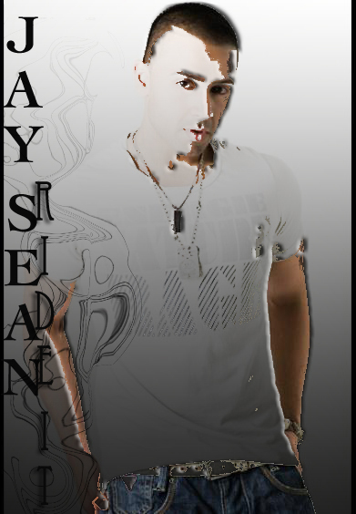 |
| This design was influenced by one of the most famous British singers known as Jay Sean. As a R&B, hip hop and pop star whose name is well known all over the world. As we share an Asian background(Punjabi/Thai) I personally find him very inspirational. His songs always hit the dance floors wherever I go. However it's not the only famous side of him that I like, I also like his personality and his attitude which I believe made him become a successful world wide singer. For the design I decided to pick this image as it looked natural and straight forward without any additions. I then dragged the image across onto Photoshop CS4 and gradually worked on the filters I like. Again with the Liquify tool I created an elephant face by carefully swirling the lines until I formed the right face of an elephant. Then I placed it on the left to present Jay Sean's Asian background. With the text I used two different fonts, one is used as an eye-catcher and another goes with the swirled elephant face. I am really pleased with the overall image as everything worked very well together giving such a strong image that I will die for. |
Subscribe to:
Comments (Atom)